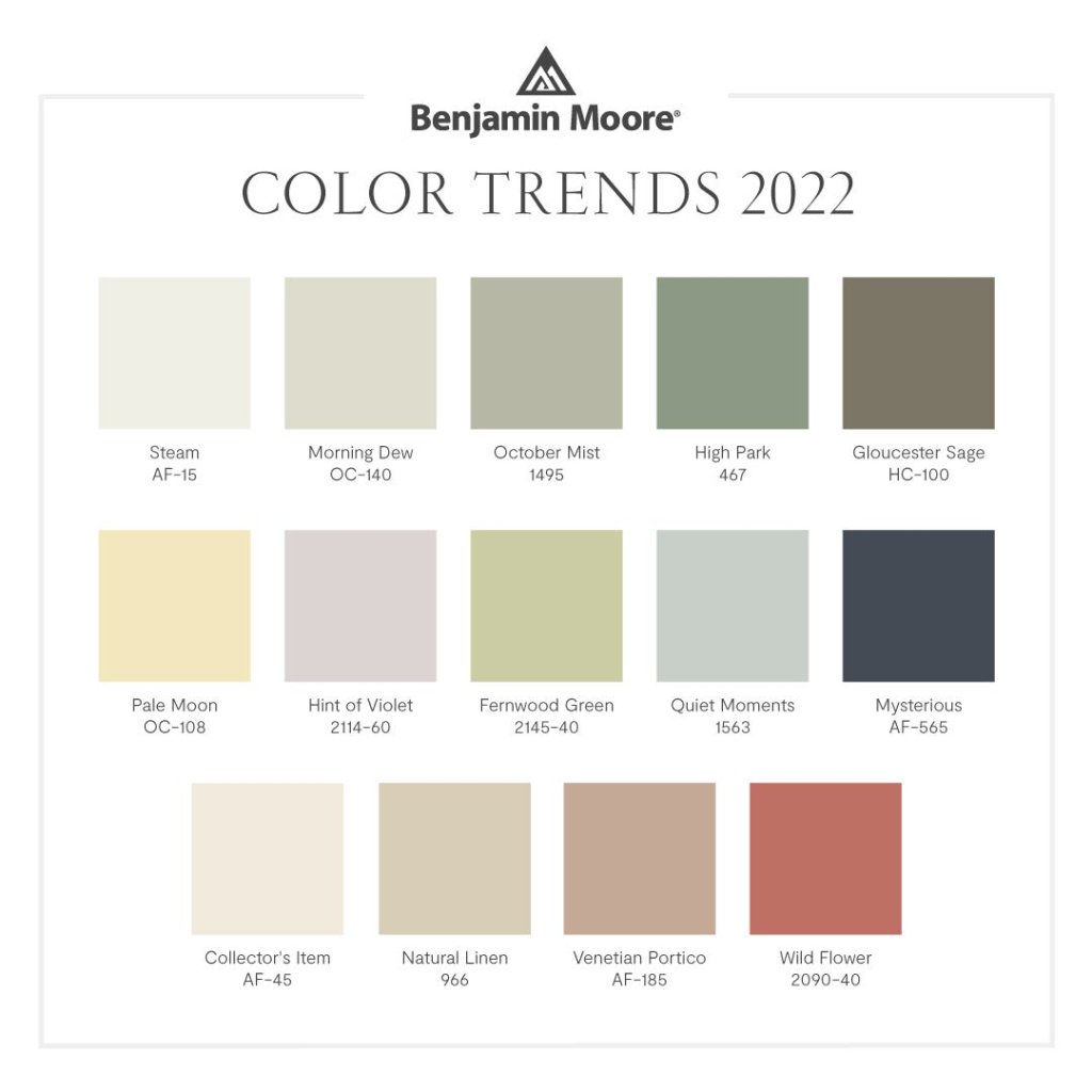
When it comes to the color scheme of their homes, the vast majority of people go for something neutral. People would be more likely to prefer softer tones. White is by far the most popular color choice for house colors and interior design projects both now and during the past few years. Because white is a crisp color that stands out and can be personalized with colorful borders, it is almost always the safest option to go with. If you’ve been contemplating on painting or repainting, here are some popular color choices and combinations for your home.
Read Also: How To Achieve That Korean-inspired Room
Color Combinations for the Exterior of the House
Because of the significant influence that they have on the entire appearance and ambiance of a building, one of the most important decisions that you will ever have to make in terms of interior design is the selection of the colors that will be used on the exterior of your home.
You are in luck since there are a few strategies and advice that you can make use of to make the selecting process a little less scary. When deciding on a color scheme for your home, there are three aspects to take into consideration: the dominant or field color, the accent color, and the color of the trim. If the majority of the homes in your neighborhood have a more muted appearance, your best bet for having your house blend in with the neighborhood is to decorate it in earth tones and neutral colors. Think about combining a field that is white or gray with a front door that is brilliant yellow, or a field that is brown or beige with shutters that are colorful green. There are many exterior color schemes that look good with white trim, but brown, black, and gray can also look good with a range of exterior colors. White trim gives the impression of being clean and crisp against almost any exterior color scheme.
Things to Remember when Picking a Color for the Exterior
There are a few things you should keep in mind when picking an exterior paint color for your home. Even while it is fine to stand out, you do not want to compete with your neighbors’ homes. Those who live in your area may get displeased as a result of this change. It is a good idea to use light trims to reflect the sun’s heat and light. Light-colored houses can accentuate the size mismatch between a large house and a small lot, which is frequent in suburban subdivisions with small lots. Darker hues might assist harmonize a house’s appearance with its surroundings.
Popular Choices for House Color Combinations and Schemes
The Benjamin Moore

- Barren Plain
- Bracken Slate
- Cape May Cobblestone
- Gray Huskie
- Hale Navy
- Iron Mountain
- Kendall Charcoal
- Olympic Mountains
- Onyx
- Seapearl
- Silver Chain
- Simply White
- White Dove
- Wrought Iron
The Sherwin Williams
- Accessible Beige
- Repose Gray
Color Combinations for the Interior of the House
Greige could be recognized as one of the most popular modern house paint colors. It is a color that is a combination of gray and beige, and it is a shade that is both more sophisticated than traditional beige and friendlier than gloomy gray. Greige tones are a well-liked option for interior painting, and for good reason: they are widely regarded as the colors of choice when it comes to the successful marketing and sale of residential properties. Recommended colors inspired: Bejamin Moore Cedar Key, Sherwin Williams Agreeable Gray, and Valspar Smoked Oyster.
Pewter is a great example of a typical gray color that has a deeper tone, which works very well as a neutral. Use a shade of gray that has a hint of blue in it to make the overall appearance less solemn and more inviting. This color looks great when paired with blue accessories that appeal to both male and feminine customers. Recommended colors inspired: Benjamin Moore Anonymous, Benjamin Moore Gray Owl, and Sherwin Williams Repose Gray.
Read Also: Tips to bring Scandinavian Style into your Home
Beige is a well-liked alternative for those seeking a neutral color, despite the fact that it is not as on-trend as the shades of gray and greige. Homeowners know they can easily paint over this color if they decide they don’t like it, making it a color choice that is considered to be risk-free for them. Recommended colors inspired: Magnolia Home Soft Linen, Sherwin Williams Accessible Beige, The Spruce Best Home Macrame Beige
House Colors that are OFF the Table for your Real Estate & House and Lot
1. Eggshell (Off-White)
White and its many variations may look like a sure choice while you are shopping at a home improvement store, but that does not mean they are assured to sell well. It was common practice to paint kitchens a wheat yellow color, which contributed to an increase in the home’s worth. But there is no need to completely forego gallery-white walls in your home. An interior designer says that painting a room white is not always a bad choice, particularly if there is a lot of natural light in the area. Yet, it is possible that white walls will make a space look “dead” and “flat” if it is a small area or if there is not much natural light in it.
2. Dark Brown
According to the findings of Zillow’s research study, consumers were not interested in homes with dark brown walls. The use of a dark brown paint color in the bedrooms resulted in a price reduction of $236 (₱10,000- ₱12,000), while the use of the same color in the bathroom resulted in a price reduction of $469 (₱22,000-P24,000). But as per the Sydney Morning Herald, some people have such a strong aversion to the color that the Australian government considered putting it on the packets of cigarettes in an effort to make smoking appear less appealing to the general public. Instead, they decided to go with a shade that was somewhere between olive and brown.
3. Terracotta
Even a more subdued terracotta tone can have a negative impact on the market value of your home, despite the fact that it is not nearly as eye-catching as traffic cone orange. Homes that had living rooms painted the same color as an inexpensive flowerpot sold for an amount that was lower than what Zillow had predicted the price to be. The color scheme that was most prominent in this space was a light gray. It has been found that orange is one of the colors that people all over the world dislike the most, and as a result, the unfavorable response that orange walls have received is not surprising. By a significant margin, the color blue is the most widely used, followed by red and then green.
Read Also: Tips On How To Furnish Your First Affordable Condominium Unit
4. Slate Gray
Although there are a variety of shades that fall under the umbrella of “gray,” the color gray is still fashionable. Dark gray was not a successful color choice for living rooms, despite the fact that its use contributed to a boost in the price at which a home might be sold. Dove or light gray was the preferred shade. If you paint the dining room a slate gray color, you may suffer a loss if and when you decide to sell your property. The dining room could be decorated in a color scheme that featured mauve, eggplant, and lavender as its primary colors.


